Short answer
The most important part of fuse bead color planning is not using more colors. It is making sure the main colors are clear, the support colors do not fight them, the value steps are separated enough, and the near-matching colors are not softening the whole design into blur.
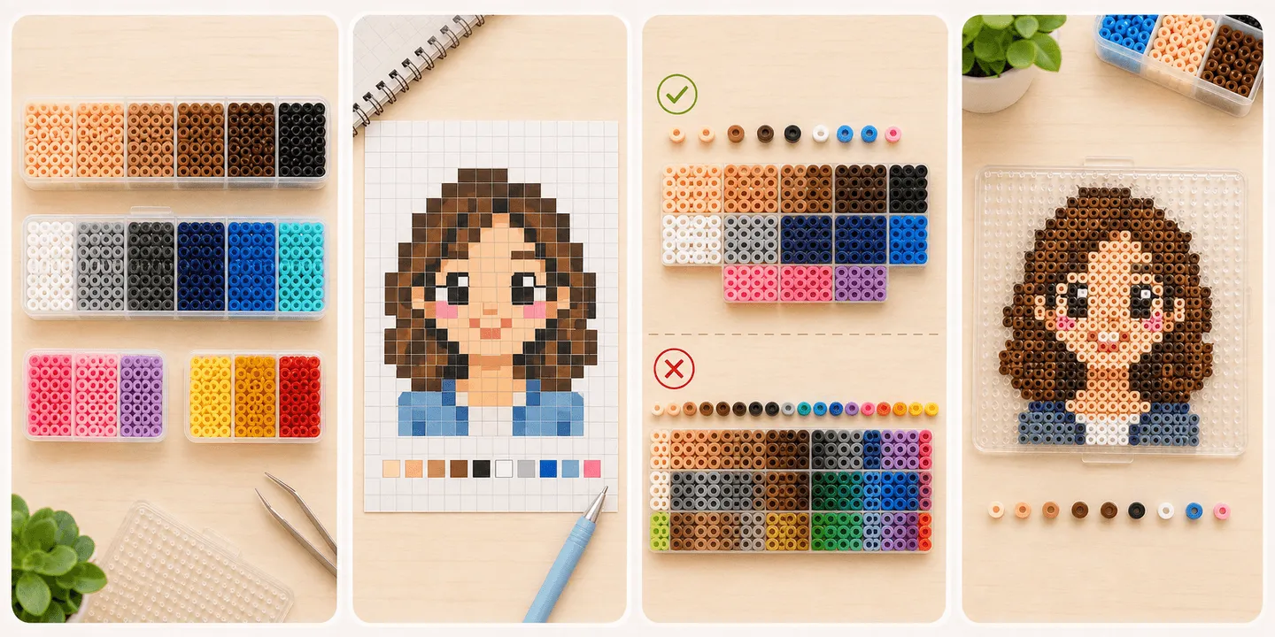
- Strong bead palettes depend on hierarchy and role separation more than on raw color count.
- Too many near-matching colors often make a piece dirtier, harder to place, and harder to fix.
- Once main colors, support colors, and accents have clear jobs, the design usually becomes much cleaner.
- A lot of “not accurate enough” color problems are really contrast and decision problems, not missing-color problems.
Separate main colors, support colors, and accents before everything starts competing
Many palettes feel messy not because one color is ugly, but because every color is trying to be equally important. Main colors should define the first impression, support colors should stabilize structure and transitions, and accents should only sharpen key moments in small amounts.
Fuse beads are especially sensitive to this because each bead edge already creates a visual cut. Every added color is another cut. If color roles are unclear, the design gets chopped into smaller and smaller pieces.
- Ask which color is the main character before asking whether you need one more color.
- Support colors should strengthen the main read, not push against it.
- The smaller the accent area, the more intentional it needs to be.
Why more colors often create dirt instead of accuracy
When people see subtle variation in a reference, they often respond by adding more and more colors. In fuse bead art, that usually backfires when many of those colors are too similar. The edges soften, the main shape scatters, and the result stops feeling more realistic and starts feeling less clean.
A larger palette also raises placement difficulty and correction cost. You are not only designing. You are increasing visual identification load. Many cleaner pieces succeed because they remove the least useful near-matches instead of preserving all of them.
- More colors do not automatically mean more readability.
- Too many near-matches soften the boundary of the subject.
- Removing one low-value color layer is often more effective than adding one.
Before color hue accuracy, check whether the value structure is open enough
A lot of flat, blurry bead art is not failing because a color is slightly too warm or too cool. It is failing because the light-dark structure never opened up enough. If two colors sit too close in value, they often collapse together at bead scale even when their hue is technically different.
That makes a simple question extremely useful: if you group the palette into light, mid, and dark steps, do the key outlines, turning points, and focal areas still separate cleanly? If not, the palette is probably not stable yet.
- Get the light-mid-dark logic right before chasing tiny color nuance.
- Different hue with nearly identical value may still fail to create a readable edge.
- Important areas should read faster than secondary ones.
When near-matching colors help and when they only create confusion
Near-matching colors are not always bad. They can help in skin, hair, fabric, and soft transitions. The problem starts when the gaps between them are so small that they increase hesitation more than structure. Then the design becomes tiring to place and visually noisy in the final piece.
A better approach is usually to keep only the near-matches that truly open structure or value steps first. Once the larger relationships work, you can decide whether the finer transitions are worth adding back.
- Keep the near-matches that separate structure, not all of them.
- If placement keeps forcing you to double-check, the colors are probably too close.
- Near-matches should support transition, not manufacture noise.
The most common color failures in skin, hair, and clothing
Skin often fails not because it is not accurate enough, but because it turns gray, dusty, or too compressed between highlight and shadow. Hair often fails because too many broken shadow fragments replace the larger mass. Clothing often fails because pattern and shading both try to dominate at the same time.
All three categories benefit from a larger-block approach first. Build a clean major shape with fewer color groups before you ask for finer variation. Without a strong base, extra colors usually add confusion rather than refinement.
- For skin, prevent grayness before chasing subtle realism.
- For hair, establish mass before fragmented shine.
- For clothing, keep the silhouette safe before preserving every pattern detail.
How to make smarter color choices when your bead palette is limited
In real projects, most people are not choosing from infinite theoretical colors. They are choosing from what their brand line and current stash can actually offer. In that situation, the smartest move is usually not to chase the most literal match, but the combination that preserves the most important roles in the design.
That means protecting main-color identity, outline contrast, and value structure first, then worrying about small hue shifts. Slightly warmer or cooler can often survive. Collapsed hierarchy usually does not.
- With a limited palette, protect structure before perfect fidelity.
- If you are missing a middle color, simplification is often better than forcing a too-close substitute.
- Readable beats theoretically accurate when the palette is constrained.
FAQ
Does using more colors always make bead art look more advanced?
No. More colors only help when hierarchy and value separation are already clear. Otherwise the result is often messier, dirtier, and harder to place.
Why does my palette look fine on screen but gray in real beads?
Usually because the value steps are too compressed, there are too many near-matching colors, or the main and support colors are competing. Screen previews hide those edge conflicts better than real beads do.
If I do not have a perfect match, should I add more colors or remove some first?
Most of the time, remove first. Lock the main colors, contrast, and value structure before deciding whether another transition color is truly necessary.
What should I check first in a bead-art palette?
Usually check whether the main colors are standing clearly, then whether the light-mid-dark steps are separated enough, and only after that whether the small near-matching transitions deserve to stay.