Short answer
Start with a photo that already has clear lighting and a readable silhouette, then protect the big shape and value groups first while actively deleting detail that becomes messy at small scale. You are not shrinking a photo. You are rebuilding it for bead readability.
- A better source image removes half the later struggle.
- Protect silhouette and value structure before chasing face detail.
- More colors do not automatically make the result look more accurate.
- Scaled-down preview is one of the fastest truth tests you have.
Choose a better source image first
Photos translate better into bead patterns when the lighting direction is clear, the subject separates cleanly from the background, and the outline can already be understood without relying on tiny texture.
If the image depends on subtle gradients, merged hair and background, or a lot of visual noise, it may still be a beautiful photo while being a poor bead source.
Crop and protect the silhouette before face detail
At bead scale, the first question is often whether the image still reads as a person, pose, or face direction at all. Tiny facial details matter much less if the overall shape is already collapsing.
Many portrait patterns fail not because the eyes are wrong but because the face shape, hair mass, and black-white balance were never stabilized first.
- Decide whether the design should be a head, bust, or smaller crop.
- Build the outer contour and main hair mass before refining features.
- If the face merges into the background when scaled down, fix the silhouette first.
Reduce color by protecting value relationships
In bead patterns, color is a structural tool more than a faithful archive of every tiny photo variation. The more you can merge similar colors into clear layers, the easier the design becomes to build and read.
Portrait work often traps people in a loop where they keep adding color to chase realism. On screen it may feel more accurate, but in beads it often becomes muddy.
- Treat color as a way to separate planes and structure.
- Merge similar colors first, then re-evaluate the likeness.
- A smaller clear palette usually works better than many fighting near-matches.
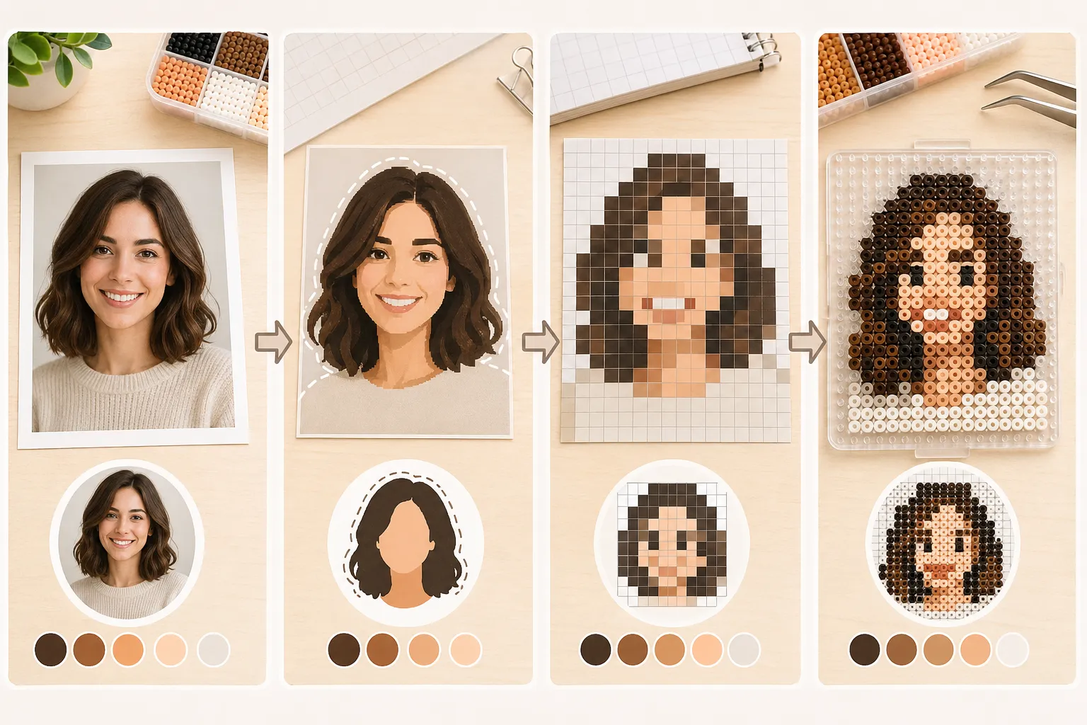
Always test the design at real scale
A photo-based pattern can look fine while zoomed in and still fail completely once it is shrunk to the actual piece size. Scale preview is not optional. It is one of the most important filters you have.
If you already know whether the piece will use 5mm or 2.6mm beads, judge the design at that working scale rather than at a comfortable large-screen view.
Know when to stop and change course
If you keep rescuing the design by adding more colors, more tiny edge fragments, and more scattered shadow pieces, that usually means the source image is not right for the current scale.
Efficient simplification is not heroic over-rescue. It is knowing when the information density is simply too high and choosing a better crop, a cleaner source, or a simpler style.
FAQ
Why do photo-based bead patterns often look muddy?
Usually because the source image depends on subtle gradients and near-matching colors, and the design was copied too literally instead of being rebuilt around clearer structure.
Are portraits always better than full-body photos for bead art?
Not always, but portraits often preserve recognition more easily at smaller sizes because the design does not have to carry as many small body details.
Does more color always improve a photo-based pattern?
No. Too many similar colors often make the piece harder to place, harder to read, and visually dirtier in the final result.
When should I give up on a photo source?
If the design only survives by constantly adding more tiny detail and more color variation, it is often a sign that the image is not suitable for the current bead scale.