Kurzantwort
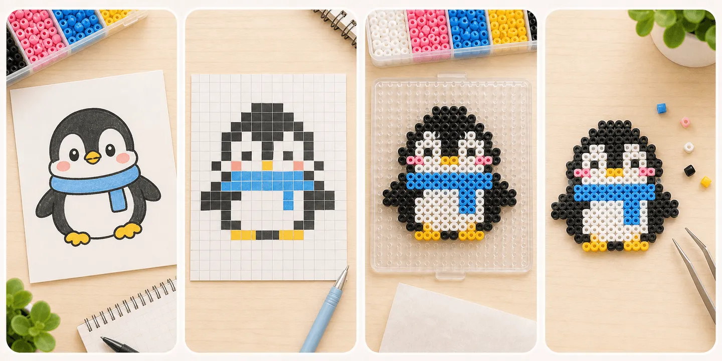
Für die erste Vorlage nimm am besten ein klares Motiv mit wenigen Farben und überschaubarer Größe. Lege Größe und Palette zuerst im Editor fest und prüfe dann, ob das Motiv in echter Perlengröße noch gut lesbar ist.
- Die erste Vorlage sollte klar und machbar sein, nicht extrem detailverliebt.
- Eine Referenz zu vereinfachen ist oft sicherer als alles neu zu zeichnen.
- Wenn du schon einen Charakter im Kopf hast, zeigt der Editor schnell, welche Details wegkönnen.
- Schwierig werden dünne Verbindungen, ähnliche Farben und zu zerhackte Kanten.
Erst klären: Referenz anpassen oder neu aufbauen?
For most beginners, the first pattern is better as a simplified reference rather than a fully original design. That lets you focus on scale, structure, and color decisions before you also take on design work.
If you already have a character in mind, you still do not need to hand-draw every square first. Build the large silhouette in the editor, then trim details until the design still reads clearly at bead scale.
- Want to practice reading and simplifying shapes: start from a reference.
- Want to build your own OC or sprite: block in the silhouette first, then refine.
- Do not pick a complex portrait as your first pattern just because it looks impressive.
Woran du erkennst, dass eine Vorlage für den Anfang zu schwer ist
Do not judge difficulty by beauty alone. Judge it by how likely it is to fail during placement, flipping, or ironing. Patterns get harder when they rely on isolated beads, hair-thin links, lots of similar colors, or a very large footprint.
A small pattern is not automatically easy. A tiny design packed with gradients, thin diagonals, and face details can be much harder than a medium pattern with bold, stable shapes.
- Keep the overall size within something you can understand at a glance.
- Fewer colors usually means fewer placement mistakes.
- Thin bridges, floating corners, and single-bead details raise break risk.
- Jagged, detail-heavy edges are easier to blur while ironing.
Ein sicherer Einstieg mit dem Tiny-Bead-Editor
The lowest-risk workflow is usually to lock the outfit, pose, size, and main color blocks in the editor before you judge the export blueprint. That gives you a chance to spot whether the design is too noisy, too crowded, or too dependent on tiny details.
If you rush to export before the clothing silhouette and pose are stable, you often create rework for yourself later. First settle what the final character should look like, then simplify and reinforce it for real beads.
- Choose the finished use first: charm, coaster, badge, or display piece.
- Dress the character first, pose it second, and only then review the export blueprint.
- Zoom out and check whether the design still reads clearly at small size.
- In export preview, inspect the edges, joins, and ruler-based size before committing.
Was du bei der ersten Vorlage besser vermeidest
The least beginner-friendly first patterns are usually photo conversions, front-facing portraits, translucent illustration effects, and artwork that only works because of large gradients. They can look great on screen and still collapse into noise at bead scale.
If you keep adding colors, tiny diagonals, and fragmented outlines just to preserve likeness, the pattern is probably not ready yet. A cleaner subject is usually the smarter first win.
- Do not make a detailed real-person portrait your first attempt.
- Do not choose a huge pattern just because you want a dramatic result.
- Do not depend on many near-identical colors for a first build.
- Do not ignore structural strength just because the pattern looks good on screen.