Kurzantwort
Nimm zuerst ein Foto mit klarer Lichtrichtung und gut lesbarer Silhouette und sichere dann große Formen und Helligkeitsgruppen, bevor du um kleine Gesichtsdetails kämpfst. Was im Kleinformat schmutzig wirkt, sollte oft rausfliegen.
- Ein besseres Ausgangsbild nimmt schon die Hälfte des späteren Kampfs weg.
- Silhouette und Hell-Dunkel-Struktur kommen vor Gesichtsdetails.
- Mehr Farben bedeuten nicht automatisch mehr Ähnlichkeit.
- Die verkleinerte Vorschau ist einer der ehrlichsten Tests überhaupt.
Zuerst das bessere Ausgangsbild wählen
Photos translate better into bead patterns when the lighting direction is clear, the subject separates cleanly from the background, and the outline can already be understood without relying on tiny texture.
If the image depends on subtle gradients, merged hair and background, or a lot of visual noise, it may still be a beautiful photo while being a poor bead source.
Vor dem Gesicht erst Zuschnitt und Silhouette sichern
At bead scale, the first question is often whether the image still reads as a person, pose, or face direction at all. Tiny facial details matter much less if the overall shape is already collapsing.
Many portrait patterns fail not because the eyes are wrong but because the face shape, hair mass, and black-white balance were never stabilized first.
- Decide whether the design should be a head, bust, or smaller crop.
- Build the outer contour and main hair mass before refining features.
- If the face merges into the background when scaled down, fix the silhouette first.
Farben reduzieren, aber Wertbeziehungen bewahren
In bead patterns, color is a structural tool more than a faithful archive of every tiny photo variation. The more you can merge similar colors into clear layers, the easier the design becomes to build and read.
Portrait work often traps people in a loop where they keep adding color to chase realism. On screen it may feel more accurate, but in beads it often becomes muddy.
- Treat color as a way to separate planes and structure.
- Merge similar colors first, then re-evaluate the likeness.
- A smaller clear palette usually works better than many fighting near-matches.
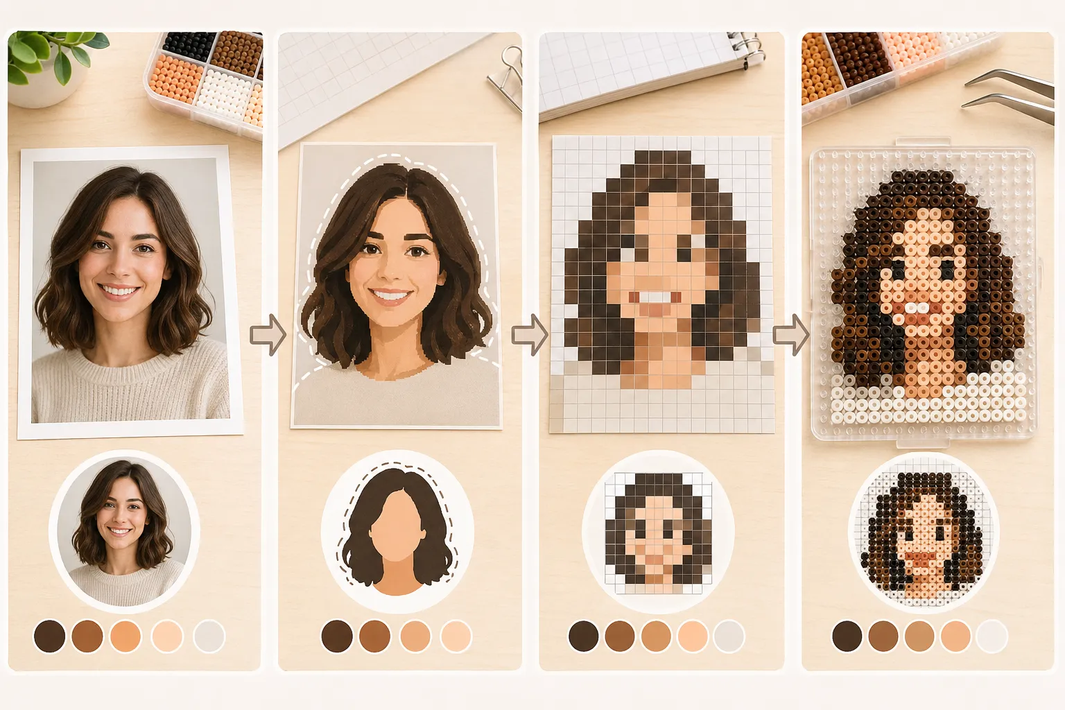
Immer in echter Zielgröße prüfen
A photo-based pattern can look fine while zoomed in and still fail completely once it is shrunk to the actual piece size. Scale preview is not optional. It is one of the most important filters you have.
If you already know whether the piece will use 5mm or 2.6mm beads, judge the design at that working scale rather than at a comfortable large-screen view.
Wissen, wann man stoppen und umdenken sollte
If you keep rescuing the design by adding more colors, more tiny edge fragments, and more scattered shadow pieces, that usually means the source image is not right for the current scale.
Efficient simplification is not heroic over-rescue. It is knowing when the information density is simply too high and choosing a better crop, a cleaner source, or a simpler style.